HachikasenJapanese Restaurant
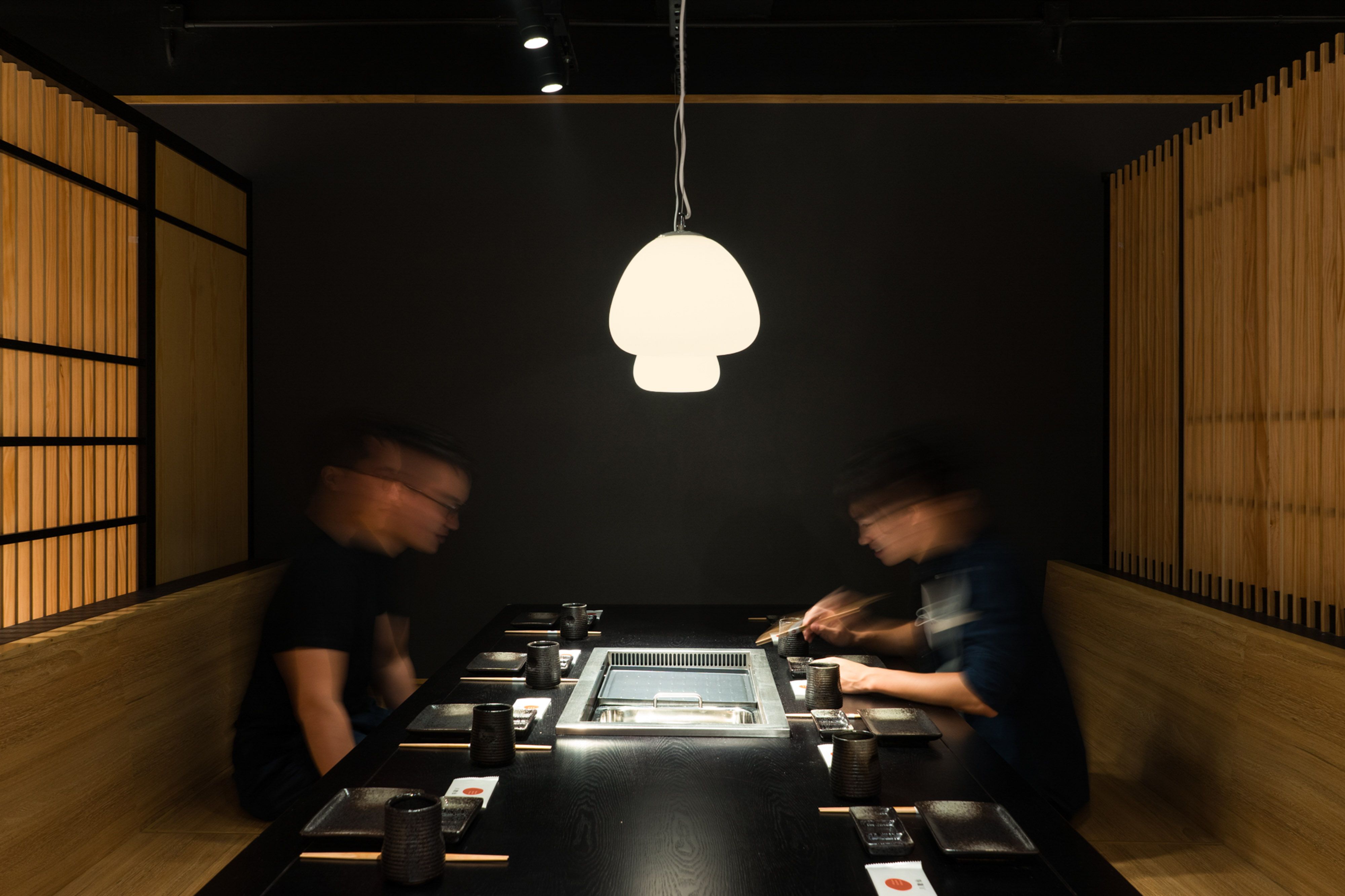
Combining yakiniku with sukiyaki, Hachikasen is an unusual Japanese restaurant that aims to offer a unique dining experience to the young foodies in Hong Kong. To go along with the vision, the interior space is curated in a contemporary manner with simplification and reinterpretation of traditional Japanese spatial elements.
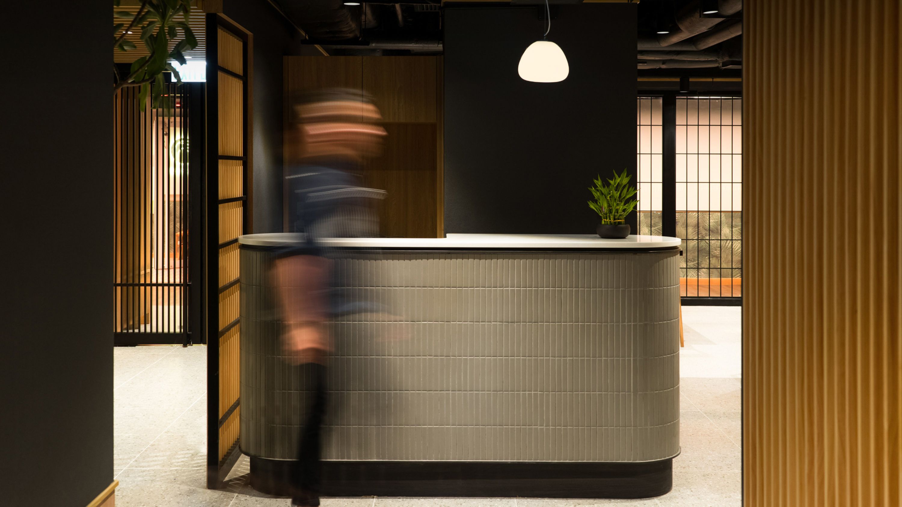
Upon arrival, visitors are greeted with a rhythmic tunnel made with pine wood stripes that resonates with ancient Torii gates tunnel. With warm light diffusing along both sides, the compressed passage marks the beginning of a tranquil journey that takes one away from the hustle and bustle.
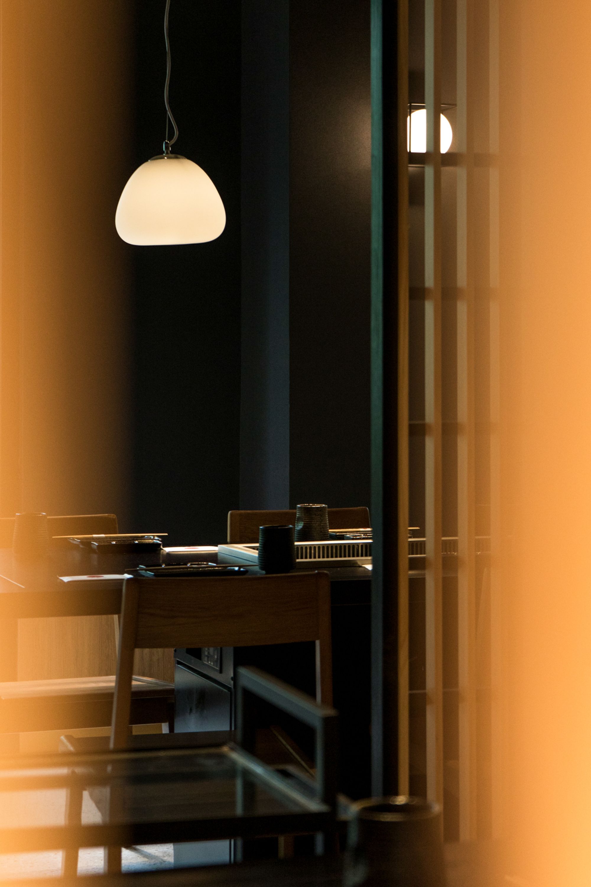
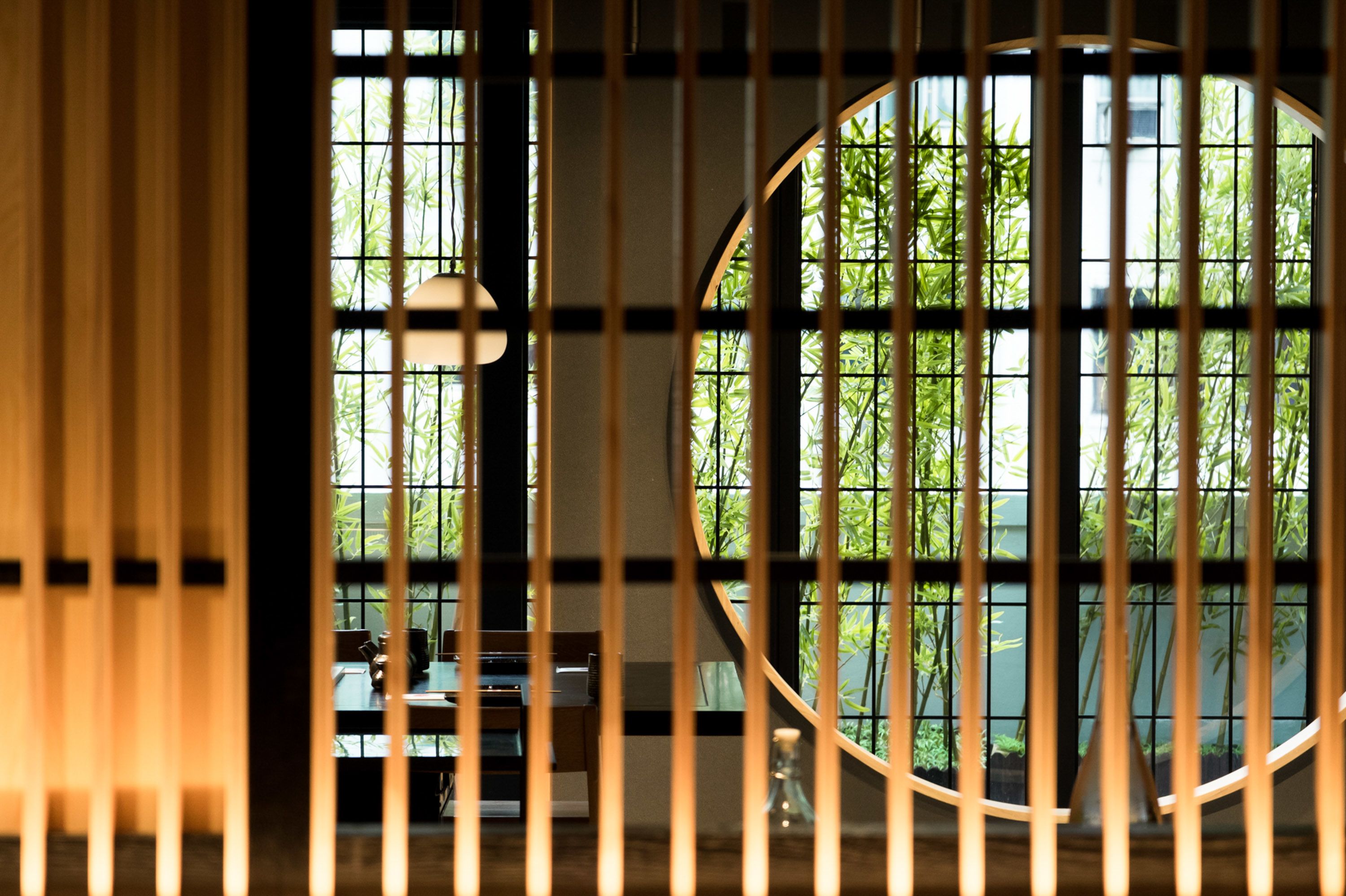
Conventional Shoji partitions are reconstructed with natural and black stained finishes pine wood. With enlarged vertical members and reduced horizontal elements, the entrance rhythm is carried into and disseminated throughout the interior space. Playful juxtaposition of solid and transparent partitions creates a change of visibility, extending the depth of space at certain visual angles while providing privacy at other needed areas.

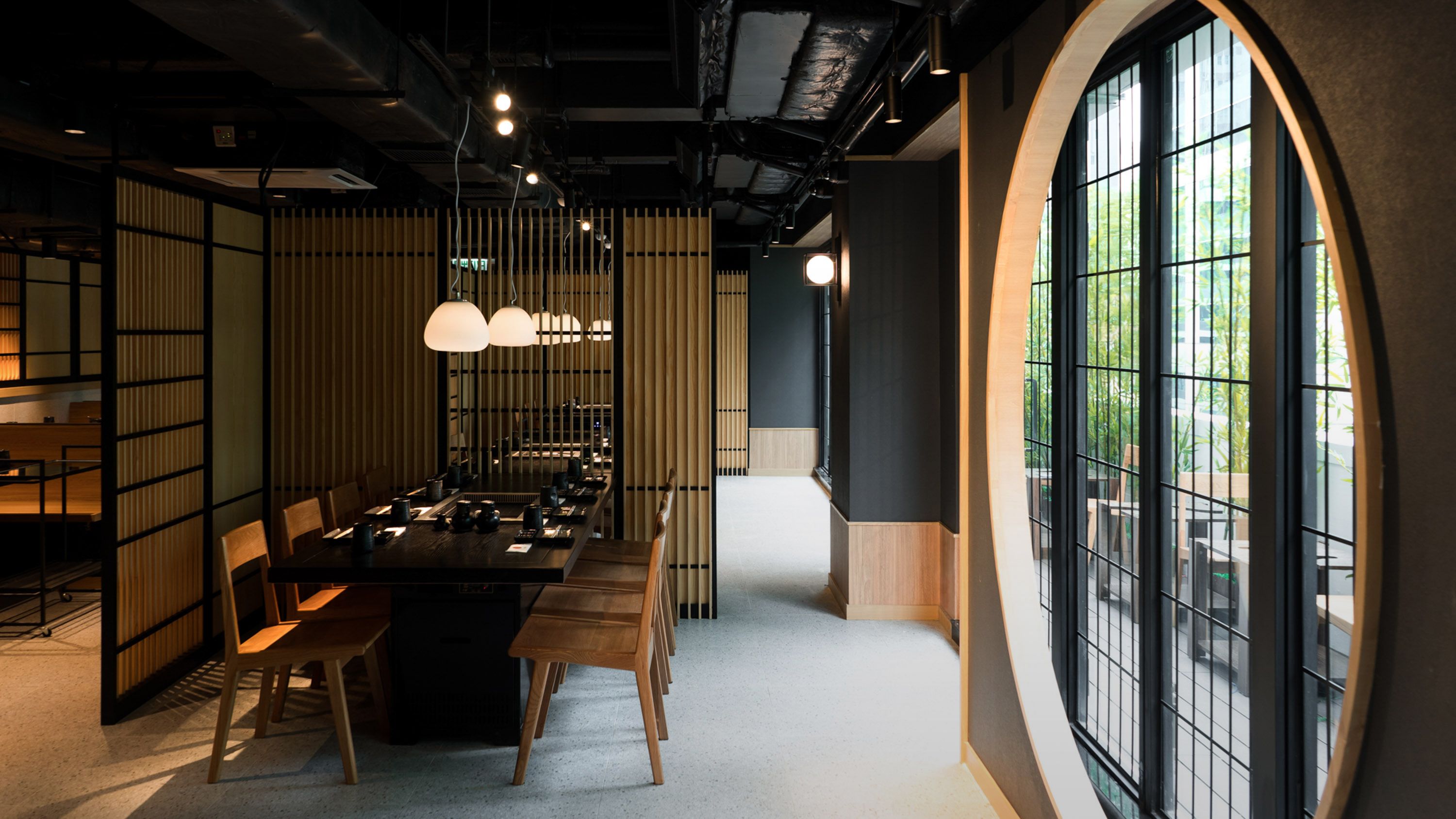
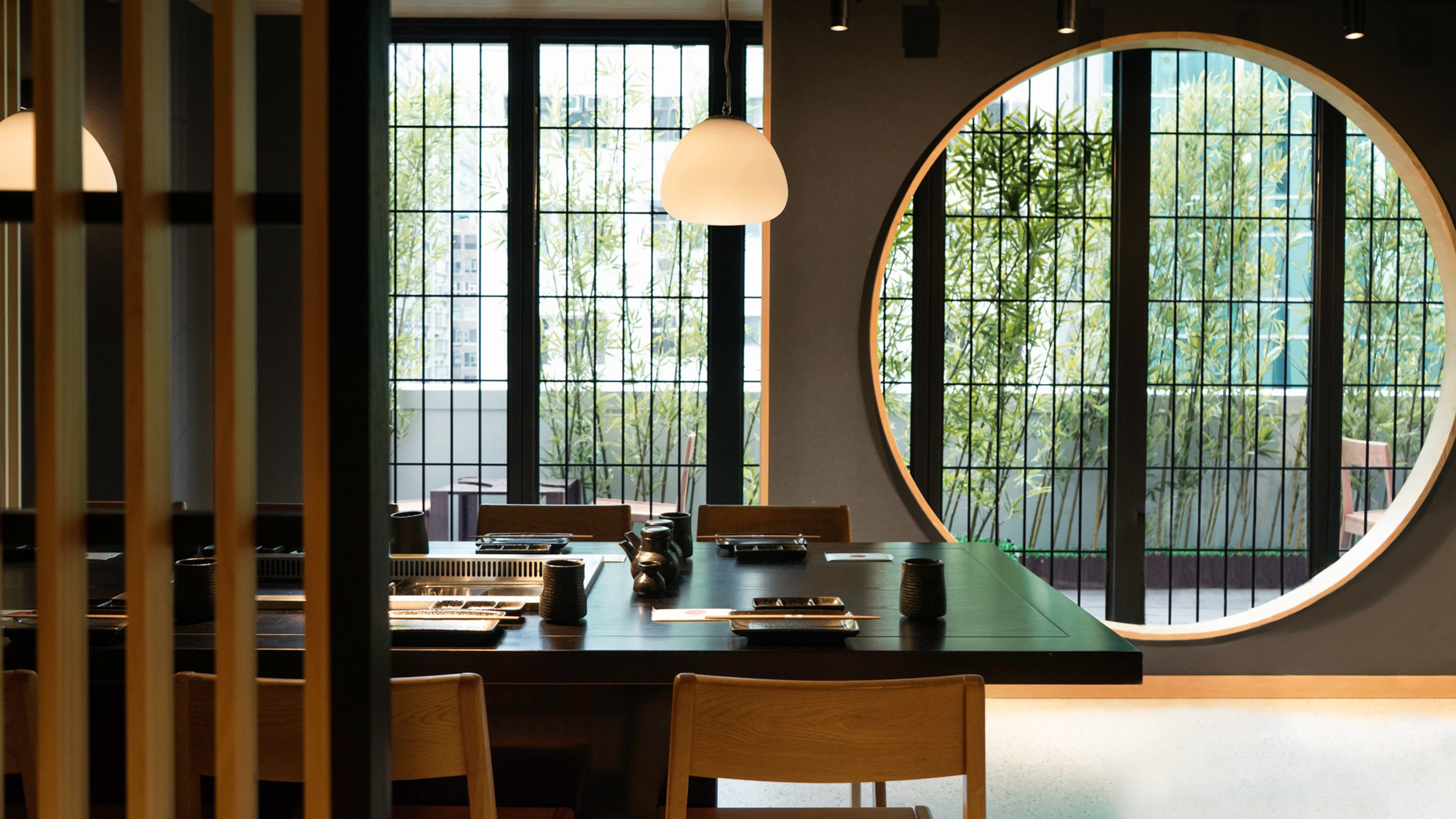
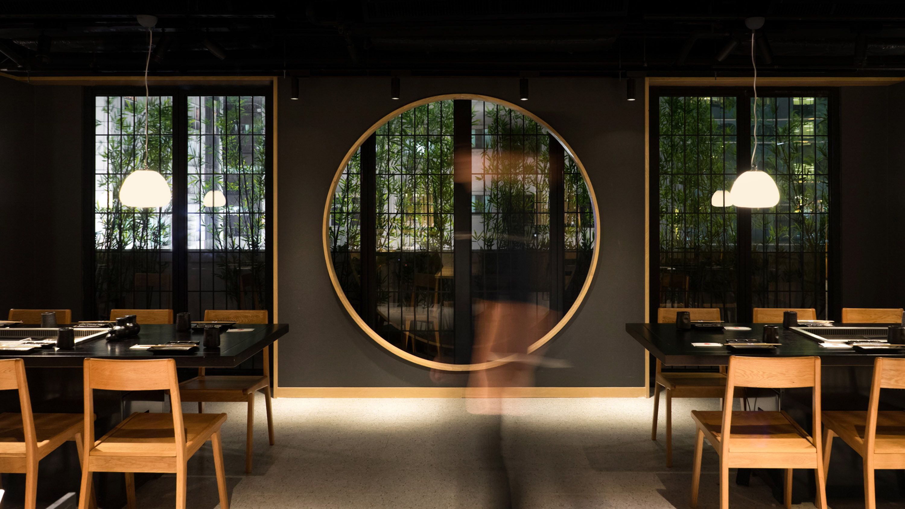
Inspired by Marumado windows, two round frames with contrasting size and transparency are placed in the space to create moments of pauses. The smaller one that glows with hidden light delivers warmth and coziness to the waiting area while the larger one frames the exterior plantation and cityscape behind.
With above mentioned tectonic twists as well as the minimal use of colors, the project opportunely marries Japanese proportions with Scandinavian aesthetics.
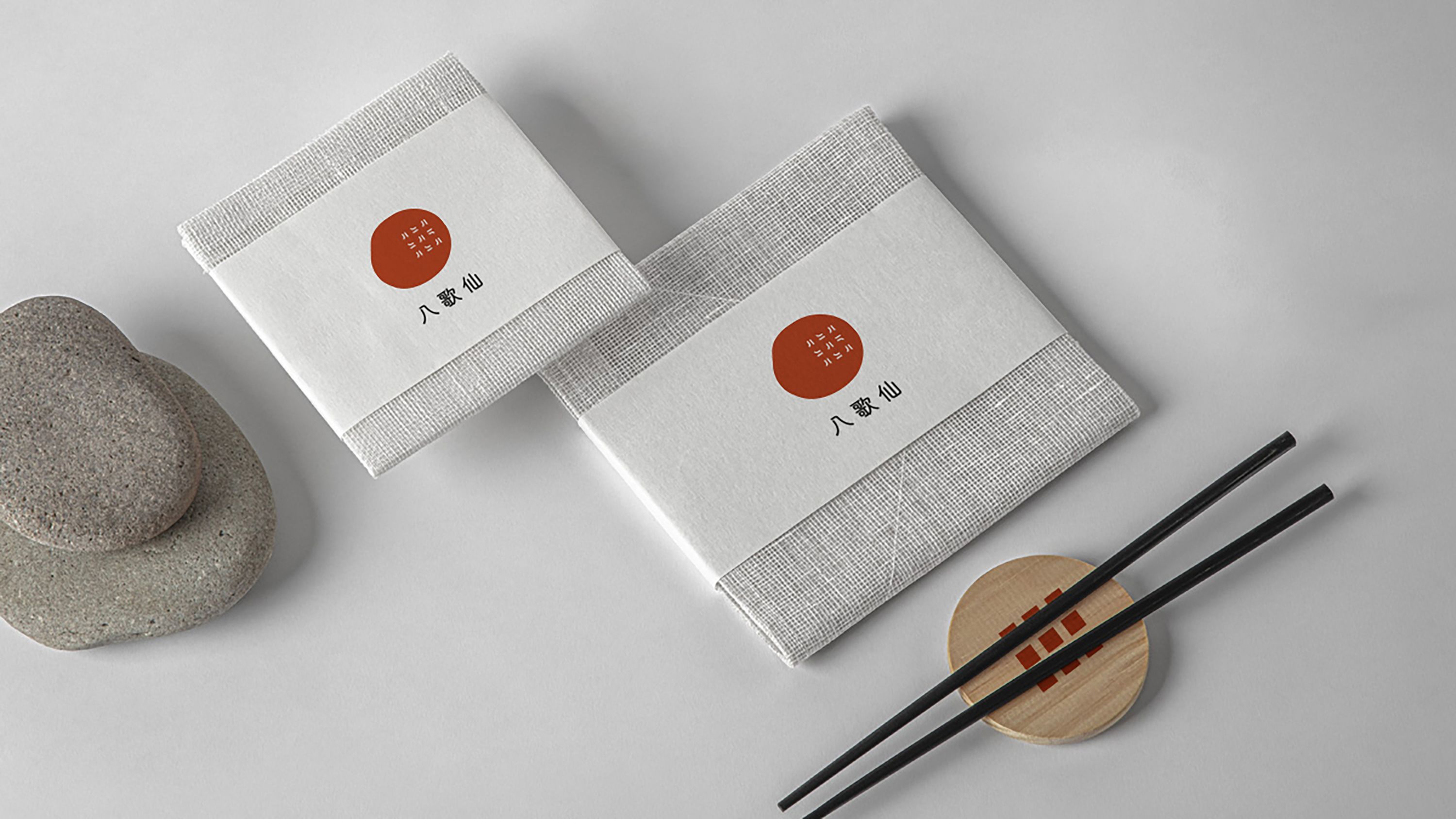
Brand Identity Concept
Combining Yakiniku with Sukiyaki, Hachikasen is an unusual Japanese restaurant that aims to offer a unique dining experience to the young foodies in Hong Kong. To go along with the vision, the interior and brand identity are curated in a contemporary manner with simplification and reinterpretation of traditional Japanese elements.
The brand logo plays with a bold and organic form in flaming red, resembling a fresh slice of beef. The Chinese character "八" is duplicated in various directions to form a grid pattern, symbolizing the delicate and unique snowflake on the beef. For the logotype, a clean and thin line sans serif font is used, creating a contrast with the bold and organic logo symbol.